Best Fonts for Pet Tags: What a Finder Can Actually Read
 Shiloh’s House Team
·
·
16 min read
The best font for a pet tag is a plain, medium-weight sans serif such as Arial, Helvetica, Verdana or Futura, engraved at least about 2.5 mm tall (roughly 10 point) with generous letter spacing and strong dark-on-light or light-on-dark contrast. A tag is read once, fast, by a stranger holding a squirming animal in bad light, so legibility beats prettiness. Save script and decorative fonts for the name, never the phone number, and write that number as digits and hyphens only.
Last updated: October 2025
Why does legibility matter more than style on a pet tag?
A pet tag is a tiny sign read exactly once, by a stranger crouching on a sidewalk with one hand on a collar and a phone in the other. The light may be bad, the tag swinging, scratched or upside down, the reader a child or a neighbor without glasses. Your font has one job: deliver a name and a phone number without a single misread digit.
That is why the stat above matters even though it is about microchips. When a chip failed to bring a pet home, the usual cause was a phone number that did not work. An engraved tag has the same failure mode, plus one more: the number can be perfectly current and still fail because the finder reads a 3 as an 8.
“In the study, the biggest reason owners couldn’t be found was because of an incorrect or disconnected phone number in the registration database. The chip is only as good as my ability as a pet owner to keep my information up to date in the registry.”
Linda K. Lord, DVM, PhD, assistant professor of veterinary preventive medicine, The Ohio State University, Ohio State News (2009)
Lord’s 2007 study of lost dogs in Ohio found the personal ID tag was one of the two most successful routes home, with a 31 percent success rate. Our checklist of what to put on a dog ID tag covers the content; this post covers the lettering.

What does reading research say about small text?
Start with size. Gordon Legge and Charles Bigelow’s 2011 review in the Journal of Vision found that people with normal vision read at full speed across a tenfold range of x-heights (the height of a lowercase x), from about 0.2 to 2 degrees of visual angle, or 1.4 mm to 14 mm at a 40 cm reading distance. Below that critical print size, reading speed drops off a cliff. Bigelow’s 2019 review in Vision Research adds that a century of studies converge on an x-height of about 1.5 mm as the smallest size that reads easily.
Next, serifs. Aries Arditi and Jianna Cho at Lighthouse International built fonts that differed only in serif size and tested them in 2005. Serifs made no difference to reading speed, and at tiny sizes they very slightly hurt letter recognition. What made a large, consistent difference was letter spacing: tightly packed letters crowd one another and push the size threshold up.
Finally, letter shape. Sofie Beier and Kevin Larson’s 2010 study of frequently misrecognized letters found that narrow letters become more legible when widened. Wide, open, simple letters survive bad conditions; narrow, fussy ones do not.
| Finding | Figure | Source |
|---|---|---|
| Fluent reading range (x-height at 40 cm) | 1.4 mm to 14 mm (0.2° to 2°) | Legge & Bigelow, 2011 |
| Smallest x-height that reads easily | About 1.5 mm | Bigelow, 2019 |
| Effect of serifs on reading speed | None measurable | Arditi & Cho, 2005 |
| Sans serif speed advantage at very small sizes | About 20% faster | Yager & Bigelow, 2002 |
| Mixed-case vs all-caps recognition distance, highway signs | Up to 14% farther by day, 16% at night | Garvey, Pietrucha & Meeker, 1997 |
| ADA minimum character height for visual signs | 5/8 in (16 mm); stroke 10–30% of height; spacing 10–35% | U.S. Access Board, 2010 ADA Standards |
Which fonts engrave well on acrylic and metal?
A laser or a stamping die cares about stroke width, the open spaces inside letters (counters) and the gaps between letters. Engraving removes material along every stroke, so strokes come out slightly fatter than the digital outline and the counters in a, e, 6, 8, B and R shrink. A thin stroke can vanish, and a tight counter can turn a 6 into a blob.
That is why clean geometric and humanist sans serifs dominate good engraving. Arial and Helvetica have even strokes, open counters and wide numerals. Verdana, designed for low-resolution screens, has an unusually large x-height and loose spacing, exactly what a 25 mm tag wants. Futura and Gotham-style faces engrave cleanly in medium weights. Trotec’s handbook for engravers notes that cast acrylic reproduces even fine details as a bright white mark, so on good material the font is the bottleneck, not the machine.
Four categories fail at tag sizes. Thin fonts lose strokes. Script fonts connect letters with tails that merge once engraved. Condensed fonts squeeze the counters that Beier and Larson showed need widening. Decorative faces add ornaments that become noise at 3 mm. The U.S. Access Board bans italic, script and highly decorative characters on accessible signage for the same reasons. The table is our working guidance, built on the Laser Co’s 10-point floor for engraved text and the 1.5 mm x-height floor from the research.
| Font family | Style | Suggested minimum height | Legibility notes | Best for |
|---|---|---|---|---|
| Arial / Helvetica | Neo-grotesque sans | 2.5 mm caps (10 pt) | Even strokes, wide digits; capital I and lowercase l look alike | Phone number |
| Verdana | Humanist sans, wide | 2.5 mm caps (10 pt) | Large x-height, loose spacing; needs more width | Phone number on larger tags |
| Futura / Gotham-style | Geometric sans, medium | 3 mm caps (12 pt) | Round, open shapes; light weights thin out | Name, or number in medium weight |
| Slab serif (Rockwell style) | Low-contrast serif | 3 mm caps (12 pt) | Thick serifs survive; thin serifs like Times do not | Pet name |
| Script / brush | Connected script | 5 mm caps or larger | Connectors merge, thin strokes vanish | Pet name on front only |
| Decorative display | Ornamented, inline, shadowed | Not recommended under 6 mm | Ornament becomes noise; excluded from ADA signs | Novelty only |
Plenty of good shops offer the fun fonts. Em & Me Studio sells acrylic tags with script and other font options and color-filled engraving; Kissamo makes decorative character-shaped acrylic tags with optional front engraving and a clean, simple font for the contact text on the back. Both are fine for the pet’s name; keep the number plain. Our acrylic vs metal dog tags comparison explains how each material holds an engraving over years of wear.
How tall should the letters be and how many will fit?
Three independent floors agree. The reading research puts easy reading at an x-height of about 1.5 mm; in a typical sans serif the x-height is about 55 percent of the capital height (the proportion Arditi and Cho used), so capitals and digits land at about 2.7 mm. The Laser Co, an engraving shop, recommends 10 point and above for engraved text, noting that 10 point text that reads fine on paper is much harder to read on acrylic; 10 point Arial has capitals about 2.5 mm tall. And for signs read from a step away, the ADA Standards require characters at least 5/8 inch (16 mm) tall.
So treat 2.5 mm as the floor for the phone number and 3 mm as comfortable. How much fits is then arithmetic. If each capital or digit plus its gap takes up roughly one character height of width (the ADA rules put a capital O at 55 to 110 percent of the I height, plus 10 to 35 percent spacing), a line holds about as many characters as its usable width divided by the character height. The table is our estimate on that basis; your engraver’s proof is the final word.
| Tag width (line after 3 mm margins) | 2 mm caps (about 8 pt) | 2.5 mm caps (about 10 pt) | 3 mm caps (about 12 pt) | Fits 555-555-5555 (12 characters)? |
|---|---|---|---|---|
| 25 mm tag (19 mm line) | About 9 | About 7 | About 6 | Only as 555-555 / 5555 on two lines |
| 32 mm tag (26 mm line) | About 13 | About 10 | About 8 | Yes at 2 mm; two lines at 2.5 mm and up |
A ten-digit number at a comfortable 2.5 mm needs a line about 30 mm wide, a medium or large tag rather than the dainty one-inch disc most people picture for a cat or a Yorkie. Our guide to choosing the right size pet tag walks through sizes by pet weight, and our lightweight tag guide shows how to keep a small or senior pet’s tag wearable without shrinking the text into illegibility.
A tag a stranger can read, plus a profile they can tap
Shiloh’s House smart tags pair a laser-engraved name and phone number on premium acrylic with an NFC back that opens your pet’s live profile, so the finder can call or text with one tap even if the engraving is scuffed. $38 one-time, no subscription, made in the USA.
Which digits get confused and how should you format the phone number?
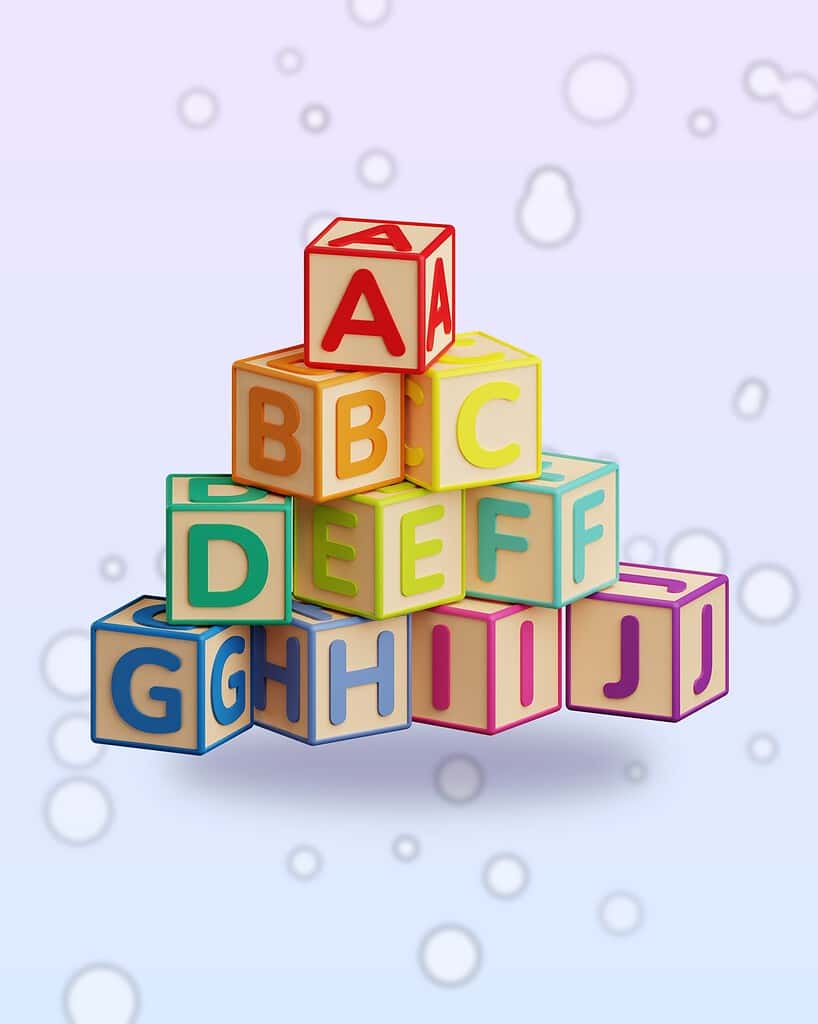
Every misdialed number from a pet tag comes down to a handful of look-alike characters. The worst offenders are the numeral 1, the capital I and the lowercase l, which in Arial and Helvetica are nearly identical vertical bars. Next come 0 against the capital O, 6 against 9, 3 against 8, 5 against S, 2 against Z and B against 8. Add wear, a shallow engraving or glare, and a finder squinting at a wriggling dog will pick the wrong one more often than you would think. Beier and Larson found that the fix is almost always more width and more distinctive shape, which is exactly what crowded, narrow or ornate fonts take away.
The most powerful fix costs nothing: keep the phone number line to digits and hyphens only. If the finder knows every character on that line is a number, the letter-versus-digit confusions disappear outright. There is no capital I to mistake for a 1 and no capital O to mistake for a 0, because there are no letters there. That is also why the owner’s name, the word CALL or a cute phrase should never share a line with the number. Put them on the front with the pet’s name or leave them off.
Formatting does the rest. Write a ten-digit North American number with hyphens between the groups, as in 555-555-5555, rather than running the digits together or separating them with periods. The hyphens break the string into three chunks a person can hold in memory while they type, and a hyphen engraves as a sturdy dash that survives wear. Periods are shallow marks that fill with dirt and disappear, and parentheses cost two characters while adding curves that can read as a C or a 0 once the engraving softens. If you cross a border with your pet, a plus sign and country code are worth the extra characters.
Skip vanity words entirely. A number spelled out as letters forces the finder to translate each letter back to a keypad digit, and many people no longer know which letters map to which numbers. If you want personality, our collection of funny dog tag sayings is for the front side, well away from the digits.
Choose a font whose digits defend themselves. Look for a 1 with a flag at the top or a foot at the bottom, a 6 and a 9 with open, curling tails rather than closed loops, a 3 with a flat top rather than a rounded one that drifts toward an 8, and a 0 noticeably narrower than a capital O. Some shops can supply a slashed zero on request. Set the digits with a little extra tracking, because spacing is the variable that most reliably lowers the size at which small characters can be told apart.
Then do what every engraver asks and almost no one does: read the proof aloud, digit by digit, against the number saved in your own phone, and have someone else do the same. Hold it at arm’s length and turn it upside down, because a tag hanging from a collar is often read inverted, and an upside-down 6 is a 9. If a digit gives you a flicker of doubt, make the whole line larger or move the number to its own side of the tag.
Should a pet tag be all caps or mixed case?
For words, the research favors mixed case. The Penn State studies behind the Clearview highway font found that destination names in mixed case could be recognized from as much as 14 percent farther away in daylight and 16 percent at night than the same names in all capitals occupying the same sign area. At a distance all-capital words look like fuzzy rectangles, while mixed-case words have ascenders and descenders that give them a distinctive outline. The Federal Highway Administration’s Clearview guidance notes that all-caps legends showed no comparable improvement.
That applies to the pet’s name, the one word a finder will say out loud. “Biscuit” in mixed case is a touch easier to read than “BISCUIT” and uses less width, which you can spend on larger letters. One trap: if your pet is named Lily or Olli, a sans serif lowercase l is a plain bar, and all caps or a font with a tailed l solves it.
For a ten-digit phone number, case is irrelevant because digits have no case. For a short alert such as REWARD, all caps is fine and compact; the Access Board allows uppercase, lowercase or both on accessible signs.
How much do contrast and finish matter?
A legible font in a low-contrast finish is still an illegible tag. Aries Arditi’s color-contrast guidelines for people with partial sight boil down to one rule: exaggerate the lightness difference between text and background, and never rely on hue or saturation alone. Combinations such as yellow on white, pale pink on lavender or gold on brass can collapse into one tone for an older finder, in dim light or for anyone with a color deficiency. Dark on light or light on dark is the only safe pattern, and it is what the ADA Standards require of accessible signs.
Finish is the other half. The Access Board calls for a non-glare finish because a glossy surface throws reflections that wash out the strokes; a shiny, unfilled engraving on polished steel is technically there and practically invisible outdoors. Depth and infill fix that: a deeper engraving casts a shadow that reads from more angles, and black or white paint in the channel gives the text its own color. On cast acrylic, a light surface engraving frosts to a bright white, which Trotec’s handbook describes as the material’s best result; extruded acrylic engraves a dull gray with little contrast, so ask what a maker uses.
Both lose legibility as grime builds up. Our guide to how to clean a pet ID tag covers restoring contrast safely on metal, acrylic and smart tags.
Does a smart NFC tag get around the character limit?
Partly. An NFC tag stores a link, not your contact details, so the finder taps it with a modern phone and a web profile opens with your number, backup contacts and notes. That number can be any length and changed any time, and the finder presses a Call or Text button instead of typing digits, so a misread 3 or 8 is no longer fatal. We lay out the trade-offs in NFC vs QR vs engraved pet tags.
What a smart tag does not do is replace the engraving. A finder may have a dead battery, no phone or no idea a tag can be tapped, and then the engraved name and number are the only thing working. A smart tag is also not a GPS tracker; it tells the finder who to call, not you where the dog is.
This is how Shiloh’s House designs its tags: a laser-engraved name and phone number on premium acrylic in a clean, legible style on the front, and “Tap Phone Here” on the back. In the free Lohji app from Shiloh’s House you build the profile the finder sees: up to three contacts with one-tap call, text, email and map buttons, voice messages, medical and behavior notes and a reward field. Because the finder presses a button rather than reading digits off a scratched tag, the engraving becomes the backup, not the single point of failure. Get the app on the App Store or Google Play.
Frequently asked questions
What is the most legible font for a pet tag?
A plain, medium-weight sans serif such as Arial, Helvetica or Verdana. These fonts have even strokes, open counters and wide numerals that survive engraving at small sizes. Research shows serifs add nothing to reading speed, while letter spacing and simple, wide shapes make a measurable difference. Save script styles for the pet’s name.
How small can engraved text be on a pet tag and still be readable?
Treat 2.5 mm capitals, about 10 point, as the floor for the phone number and 3 mm as comfortable. Reading research puts the smallest easily read x-height at about 1.5 mm, roughly 2.7 mm capitals in a sans serif, and engraving shops recommend 10 point or larger because acrylic is less forgiving than paper.
Should the phone number on a dog tag be in all caps?
Digits have no case, so the question only applies to words. For the number, what matters is size, generous spacing and a line of nothing but digits and hyphens, which removes the 1-versus-I and 0-versus-O confusions. For the pet’s name, mixed case reads slightly better than all caps according to highway-sign research.
Which numbers are most often misread on a pet tag?
The classic confusions are 1 with I and l, 0 with O, 6 with 9 (especially when a tag hangs upside down), 3 with 8, 5 with S and B with 8. Choose a font with a flagged 1, open-tailed 6 and 9 and a flat-topped 3, keep letters off the number line, and read the proof aloud.
Are script fonts bad for pet tags?
For the phone number, yes. Script connectors merge when engraved, thin strokes disappear and digits lose their distinct shapes. For the pet’s name on the front, a script at 5 mm or taller is a reasonable choice, and many shops, including Em & Me Studio, offer them. Keep the contact details in a plain sans serif.
Does an NFC smart tag mean the engraving does not matter?
No. A smart tag lets a finder tap for a profile with call and text buttons, so a misread digit is not fatal and the number can be any length. But a finder with no phone, a dead battery or no idea the tag is tappable still relies on the engraved name and number.
Sources
- Characterization of animals with microchips entering animal shelters, Lord, Ingwersen, Gray and Wintz, Journal of the American Veterinary Medical Association (2009)
- Microchips Result In Higher Rate Of Return Of Shelter Animals To Owners, Ohio State News (2009)
- Search and identification methods that owners use to find a lost dog, Lord, Wittum, Ferketich, Funk and Rajala-Schultz, Journal of the American Veterinary Medical Association (2007)
- Does Print Size Matter for Reading? A Review of Findings from Vision Science and Typography, Gordon E. Legge and Charles A. Bigelow, Journal of Vision (2011)
- Typeface features and legibility research, Charles Bigelow, Vision Research (2019)
- Serifs and font legibility, Aries Arditi and Jianna Cho, Vision Research (2005)
- Design Improvements for Frequently Misrecognized Letters, Sofie Beier and Kevin Larson, Information Design Journal (2010)
- Effects of Font and Capitalization on Legibility of Guide Signs, Garvey, Pietrucha and Meeker, Transportation Research Record (1997)
- Research: Mixed case design and word pattern studies, ClearviewHWY, summarizing Penn State Larson Transportation Institute studies (undated, accessed 2025)
- Design and Use Policy for Clearview Alphabet, Federal Highway Administration (undated, accessed 2025)
- 2010 ADA Standards for Accessible Design, Chapter 7: Communication Elements and Features (703.5 Visual Characters), U.S. Access Board (2010)
- Focus on Low Vision: Effective Color Contrast, Aries Arditi, PhD, Eyecare Business (2008)
- How Small Is Too Small? Laser Engraving Text, The Laser Co (2016)
- Tips & Tricks for Working with a Laser: Handbook for Engravers, Trotec Laser (undated, accessed 2025)